Making Sexual Assault
Prevention resources
Accessible
UX Design Case Study
Lead Interaction Designer
Purpose
A survey conducted by Stanford in 2019 showed that nearly 24% of undergraduate women have experienced sexual assault. The findings of the report inspired me and my teammates to focus on the issue in an app redesign project. We came across the mobile app, Circle of 6, which was released in 2014 and lauded for its innovative approach to sexual assault prevention.
Problem
Circle of 6 gives its user the ability to quickly contact a “Circle of 6” close friends to alert them when they are in a dangerous situation. However, my teammates and I found that the app was difficult to use and UI and UX design was outdated. Given the high pressure situations the app would be used in, it is all the more necessary that the features are intuitive and easy to access.
We identified three major tasks central to the app’s function and chose to redesign them:
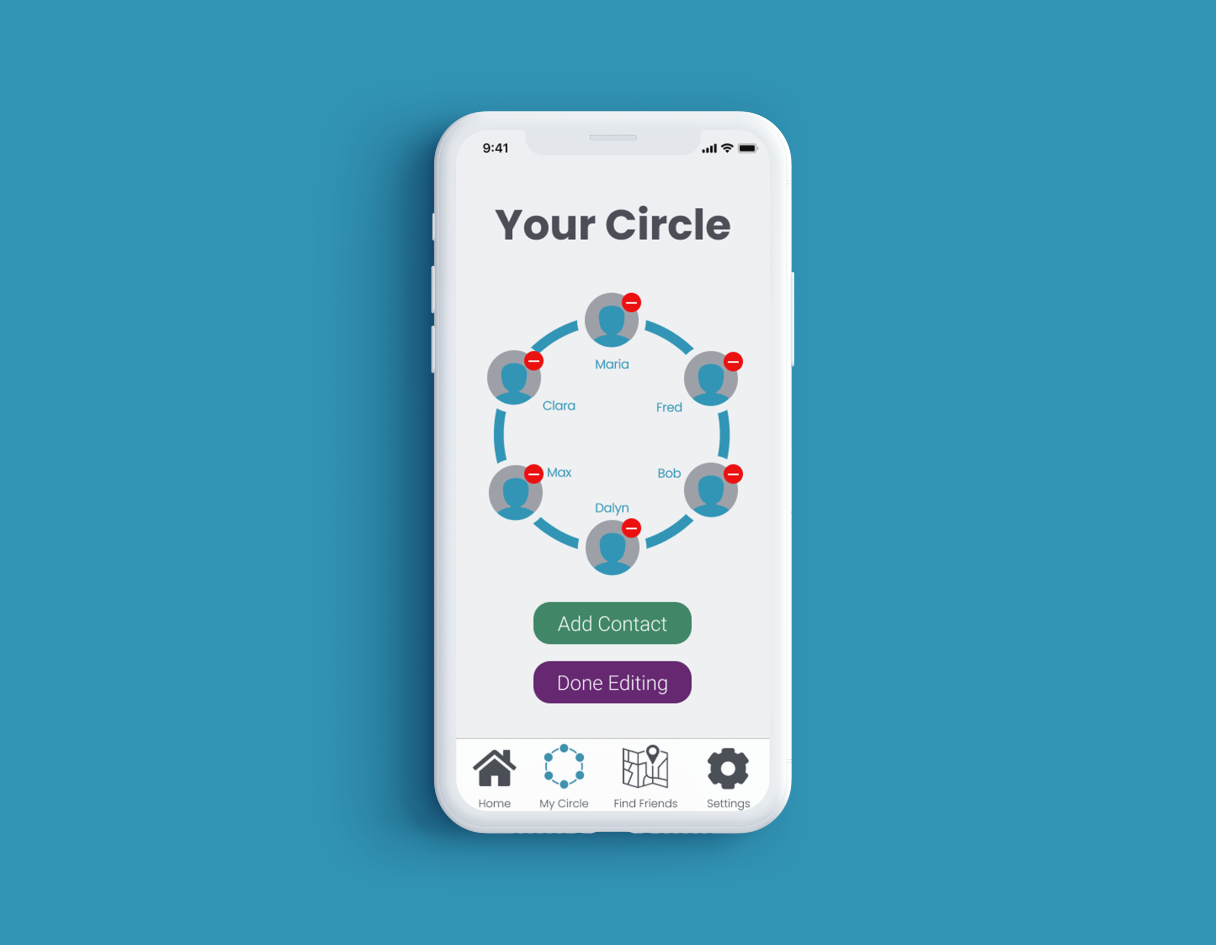
Adding and Removing Contacts
Alerting Circle of Danger
Accessing Resources
User Research
Identify User Pain Points
Method: Hierarchical Task Analysis + User Observation
To understand the pain points of the current user experience, we conducted several user tests where we asked users to complete the three tasks above and observed how they navigated the app. With our observations from the user tests, we filled in a hierarchical task analysis.
PrototypinG
Redesign and Prototype Tasks
Method: Task Flows + Rapid Prototyping + Wireframing
Tools Used: Paper Prototypes, Figma
Paper Prototypes
The first iteration of interactive prototypes based on preliminary sketches and group ideation. Design changes include:
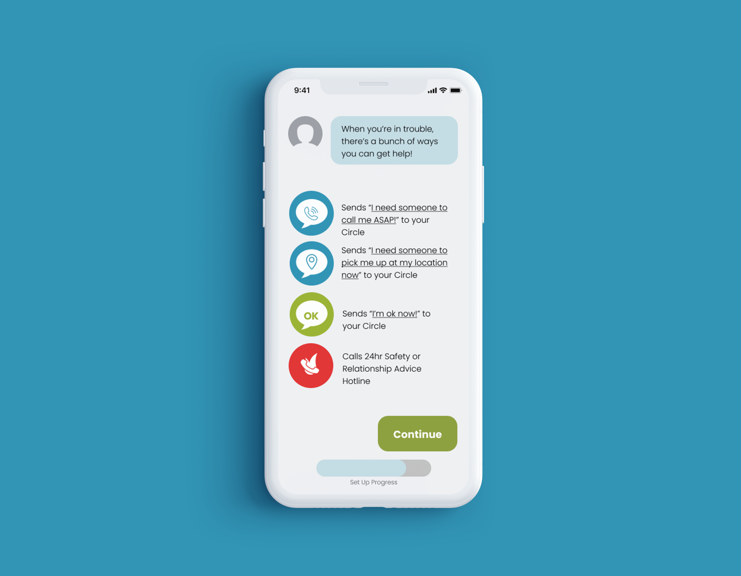
Tutorial to introduce functions and circle
Home screen with prominent alert functions
Taskbar to access circle, settings, and resources
Dedicated page for resources, clearly labeled
Wireframe
Our first digital prototype was a black and white wireframe to use for user testing. New design additions:
Interactive Chat Tutorial
Find Your Friends Map
Test & Refine
Respond to Interactive User Feedback & Refine
Method: Wireframe + User Testing Interviews
Tools Used: User Interviews, Figma, Illustrator


